MYFITNESSPAL
A redesign for My Fitness Pal, a app designed to help individuals to track their diet and exercise to achieve their fitness goals.
Tools
Adobe XD, Adobe Illustrator, Mural
Timeline
01/22/2023-05/3/2023
the OVERVIEW
MyFitnessPal is the leading nutrition and calories tracker app that helps users track their diet and exercise to achieve their fitness goals.
the PROBLEM STATEMENT
Overtime, MFP evolved to a platform with excessive features steering away from its original purpose. Still, Myfitnesspal suffers from some common problems - Unnecessary Complexity, clutter, bugs and Poor Navigation. An App used by millions of users on daily basis lacked certain qualities including clarity, high attention to core features, minimalism, i.e., to sum up, it lacked simplicity.
the PROCESS
User Personas
I started my mobile design design process by researching the current app and the needs of its users. I have a better understanding the areas where the app could be improved after analyzing this information and defining user personas.
Wireframes
Once the user flows are finsihed, wireframes can start developing design. The process of redesigning a mobile app must include wireframes since they offer a visual depiction of the structure, functionality, and overall look of the app itself. Every user flow diagram has a corresponding wireframe that was made.
the Brand Identity & UI tool Kit
A branding kit and UI toolkit aid in maintaining consistency across the design elements within an app. By creating these kits, you can boost design process performance and reduce the possibility of inconsistent results. In this instance, the brand identity is developed, ensuring a presence amongst competitors.
the Solution
I was able to use all of the user interface assets to assemble cohesive screen designs for MyFitnessPal. As for prototyping, I decided to develop interactive screens that simulate how the app will function.
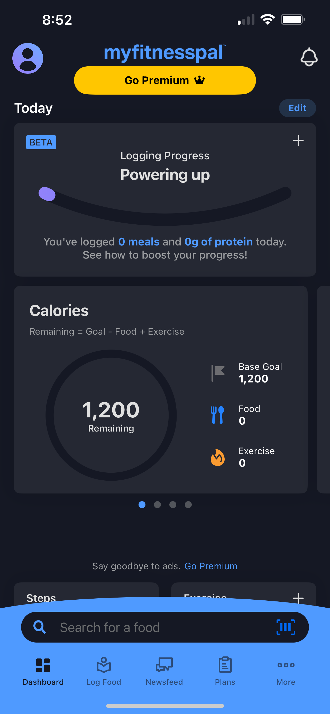
Dashboard
From the research, users reported that they rarely used the dashboard screen and would often go directly to the food log screen as they did not receive much value and insight from the dashboard. I created a version of no premium for users, so I came up with this redesign dashboard that showcases all the essential information upfront. Informing users of their current activity progression and nutrition throughout the day to ensure their goals are achieved.
Current
Redesign
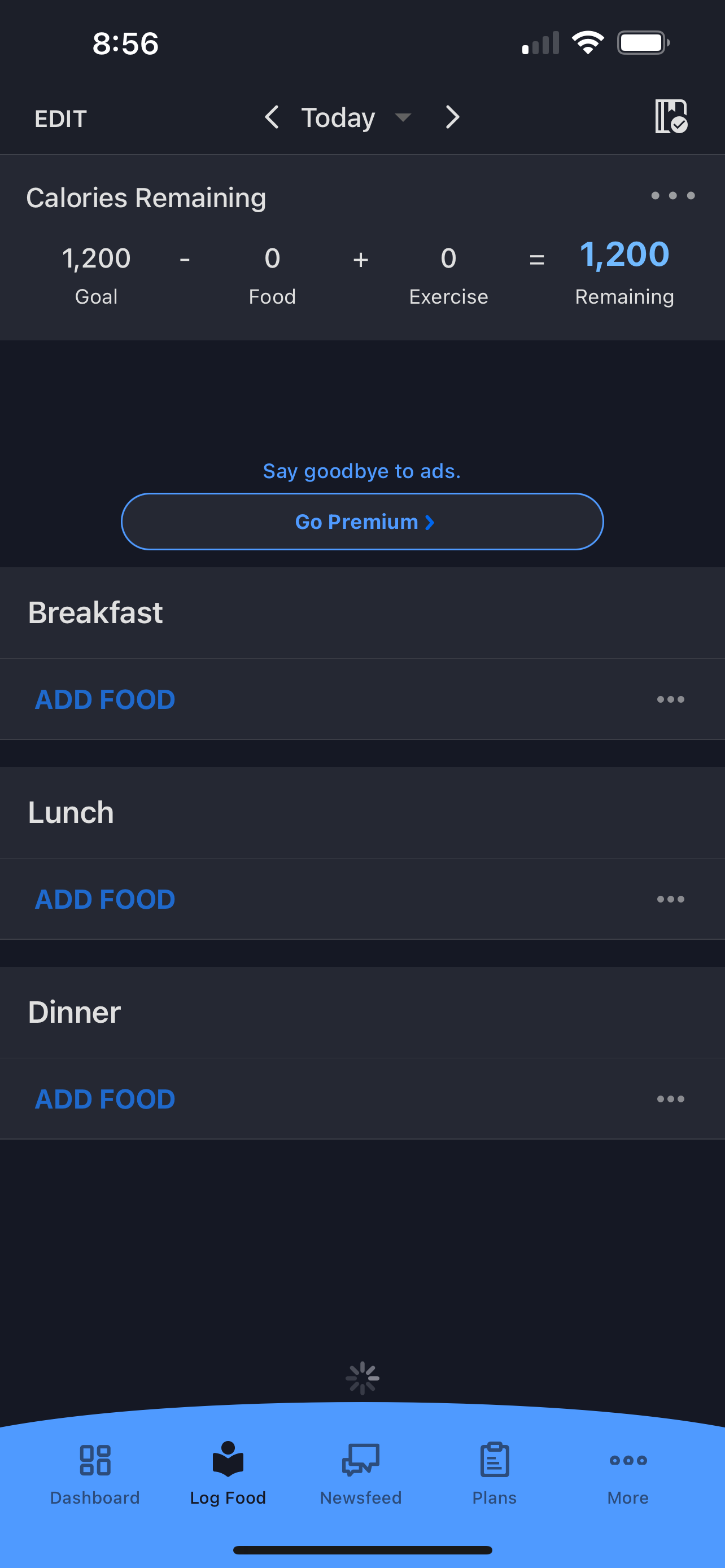
Log Food
The current’s app second tab features a diary, which is where the primary service of the users’ application wellness. This log food allows the users to track food consumption and activity goals. The Dashboard has the same feature shown at the top so you can see your day as well as sections for you to add breakfast, lunch, dinner and snacks.
Current
Redesign
A New Feature: Find Restaurants
This new feature allows users to easily log restaurant items into their food log. It comes with a map of nearby restaurant menus at a glance so users can see which options best fit their calorie and macro goals for the day.
Current
Redesign
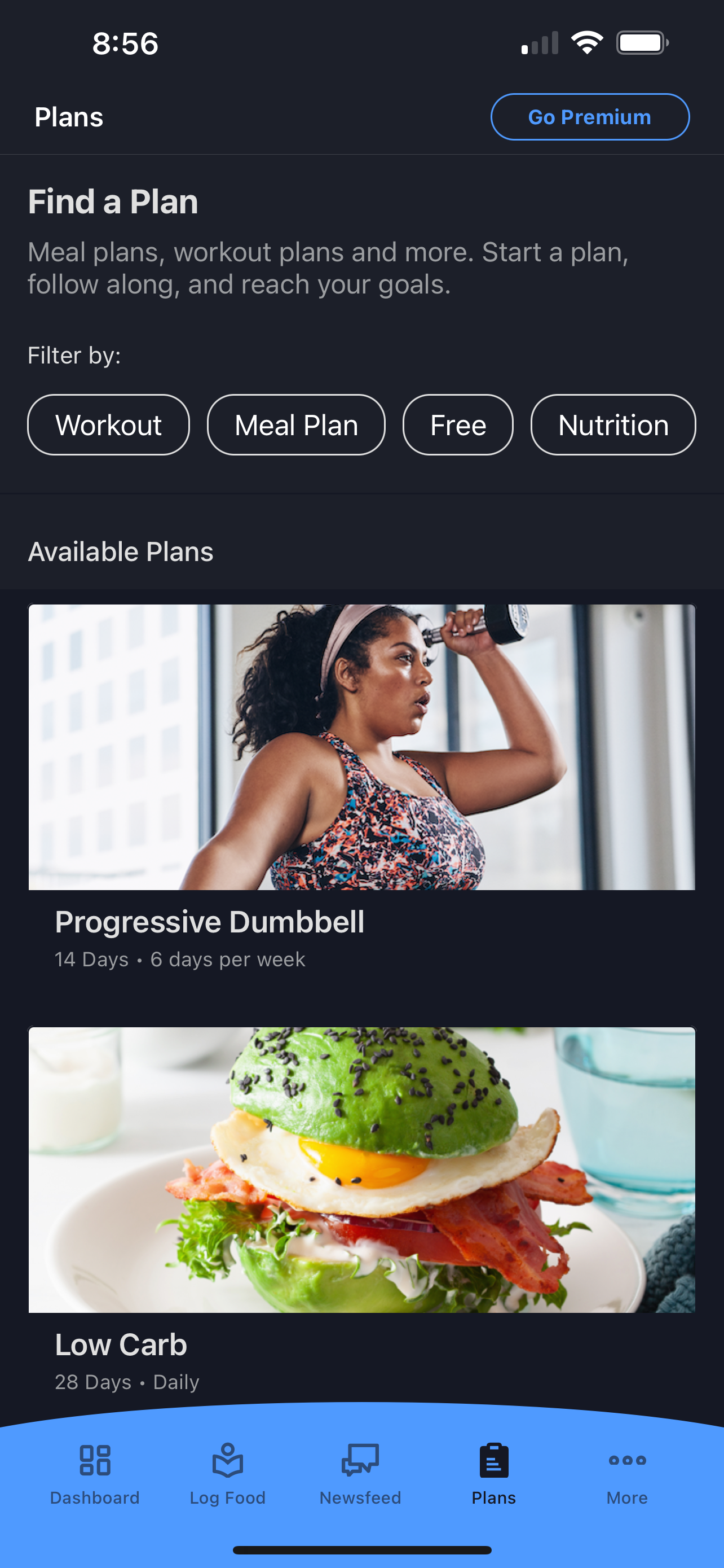
Plans
I sent out surveys and reviewed and analyzed the responses. Without a premium, they didn’t have the ability to look for the workout plan they desire. There is no search bar, and the workout plans are not organized. It limited users to browsing what workouts they wanted to do. As a result, this feature allows users to pick a workout and schedule it however they want. Once users confirm they are in, they will be directed to their schedule to see their confirmation date.
My Routines
Users have a hard time locating where to add my routines, so I made it convenient by adding a menu bar that includes explore, collections, and my routines. This makes it simple and quick for users to locate, so it makes it easier for them to log in to their workouts. In addition, this feature includes a scrollable calendar that shows all the workouts they have done or planned for the week.
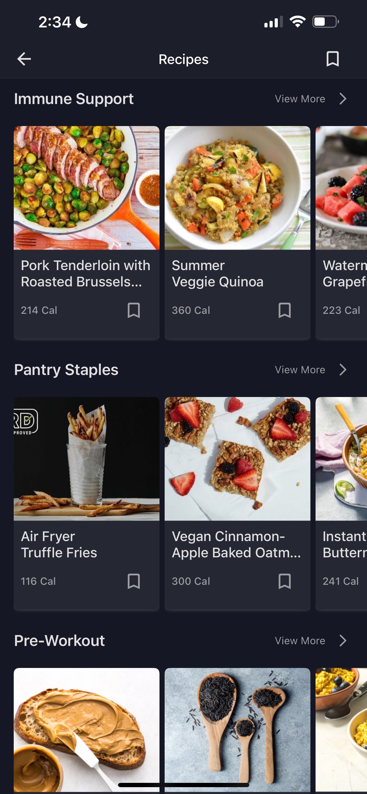
Recipes
Recipes is where users can look for a recipe they choose to make or a recipe that is similar to what they consumed, but currently, My Fitness Pal does not offer a way for the users to search for a recipe, which can lead to a lack of use. The redesign shows that I added a search bar to make the process easier for the users to find what they are looking for.
Saves
As a user, I had a hard time navigating the ‘Saved Recipes,” and I have come up with a feature that allows the user to directly go to the saved page that has all the recipes and workouts that the user wants to save for the future. The saved recipe button is located on the ‘Recipes page’ and ‘Plan page’.
Profile Page
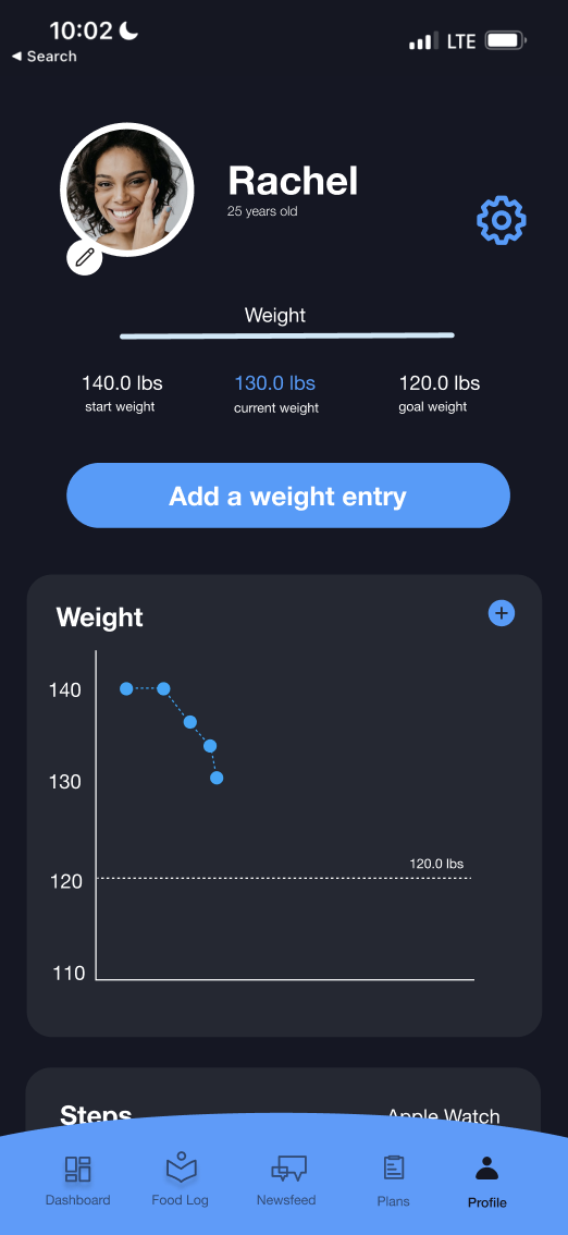
As a user, I never go on ‘more’ page due to a lack of value and insight. Users want to see information that is vital to their health. The redesign shows that I changed the icon to ‘Profile” that allows users to see all the essential information upfront. Includes progress pictures, weight entry, and reminders. I added a settings button on the right corner so the users can change all information or display.
Current
Redesign
Complete design file
IMPACT
Throughout usability testing it is clear that restructuring the app’s IA and how it presents information improves the user experience and helps to keep MyFitnesspal’s purpose/ at the forefront. While designing these pages, I kept thinking that is it too much or too less or is there a better way for the app to be structured where both user and business needs can be achieved. From research, users do not use the status or community pages and feel as if the news feed gets in the way of the app’s purpose but Myfitnesspal puts out great articles that can really benefit its users and should keep them in the app. In this case, MyFitnesspal and its users will benefit more from a redesign than a new feature.
In retrospect, this was a great learning experience to be involved in how to restructure IA from the app redesign and how to think clearly about what an app truly needs. The learning process is continuous.
And that’s a wrap. Thank you for reading!


