TRUE SILICAN HONEY
Package Redesign
the Problem
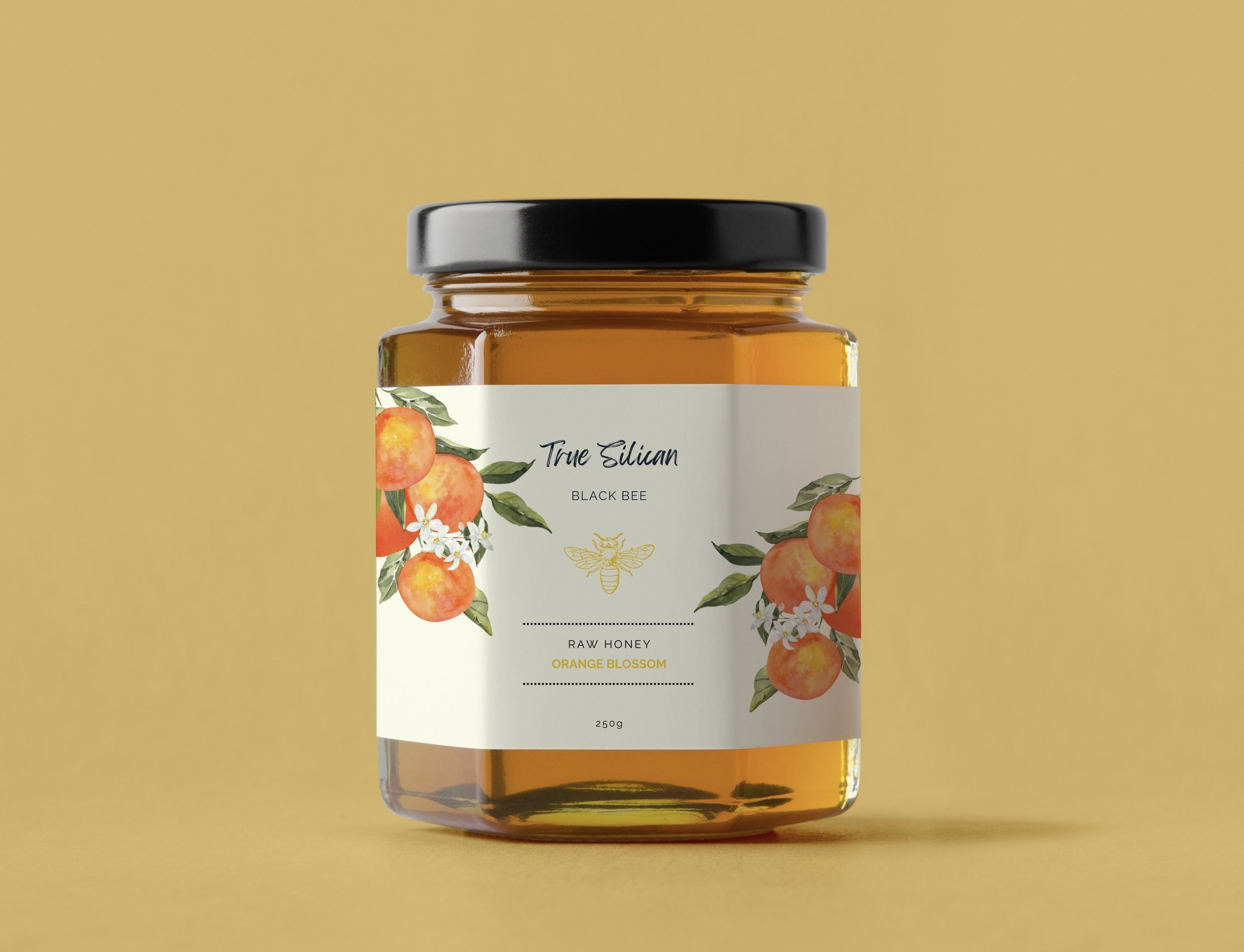
To redesign the packaging for Sicilian Black Bee Honey. The art, as is, would not catch a potential customer’s eyes. The packaging was cluttered that it was hard to read the words and on top of that with a dark background. The brand should have a clean and minimalistic design so it won’t appear chaotic.
the Process
To begin the redesign, the first step was to start visual research and get some inspiration on Pinterest. The brand needed some changes, so I began to sketch out possible design ideas and created a few compositions.
I started by looking at how typography functions to communicate the core of the honey packaging. Clean, legible fonts are necessary to convey product details while maintaining an aesthetic alignment with the purity of honey. I was aiming to create a perfect balance between modern elegance and reliable transparency through thoughtful choice and trial and error with font styles, weights and compositions.
the INSPIRATION
STUDIES
My approach to brand packaging is centered on simplicity, elegance and style. I prioritize clean lines, minimalist aesthetics and bold typography to create a design that are both visually striking and easy to understand. I had to rearrange the layouts couple of times so it can fit the band of the honey packaging.
COMPOSITIONS
Comp 1
Comp 2
FINAL COMP
CONCLUSION
After completing this project, I felt that I learned a lot about myself and my design style. This project made me look at hierarchy a new way and keeping the consistency across all brand elements, including design and color palette. In the process, I have learned how important research process is and how it has helped me along the way to create a unique, eye appealing design, I am happy with how this packaging design turned out.


