CAMP BROCHURE REDESIGN
High Adventure Summer Day Camp needs to redesign their summer camp brochure so that they can attract more families and kids to join their camp.
My role in the redesign for High Adventure Summer Day Camp was to redesign their brochure. This opportunity offered me to redesign their typography, colors and structure. Through the process, I was able to do a lot of research and design thinking to pick the best design that will help achieve the company’s goals.
RESEARCH
During the research phase, I focused on understanding the target audience for the product, as well as analyzing existing camp brochures. I investigated elements that appeal to a younger demographic, including effective color schemes suited for a summer camp theme. Additionally, I created sketches to explore typography placements and design concepts.
SKETCHES
I developed sketches to illustrate the layout of the information and the various design elements I plan to incorporate.
COLOR & TYPE STUDIES
I experimented with various color palettes and typefaces to determine the most effective combinations for the camp brochure. It was essential to select a typeface that aligned with the overall theme and tone of the design, ensuring readability and appeal. Additionally, focused on colors that would capture the essence of a summer camp atmosphere, contributing to a cohesive and inviting aesthetic.
COMPS

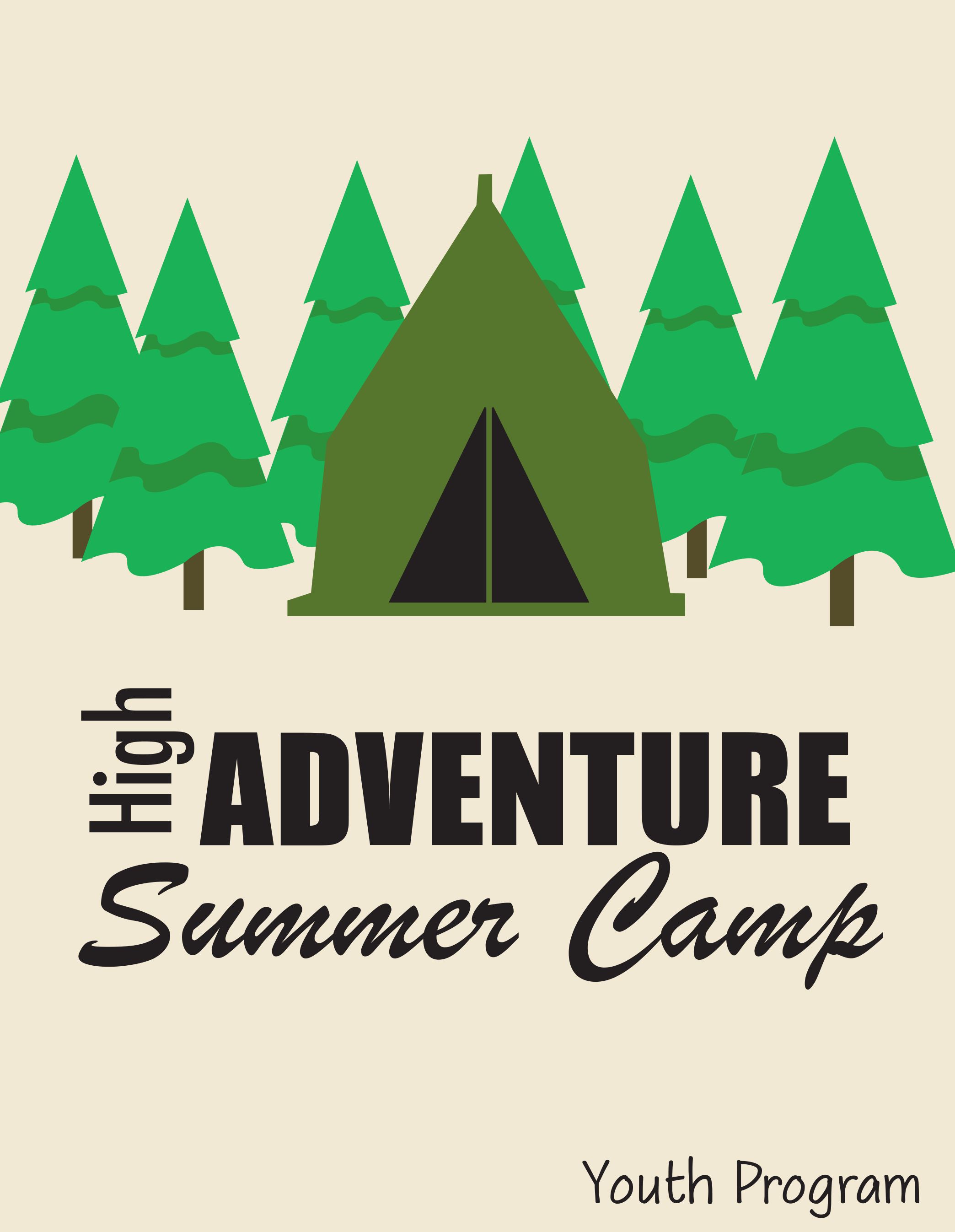

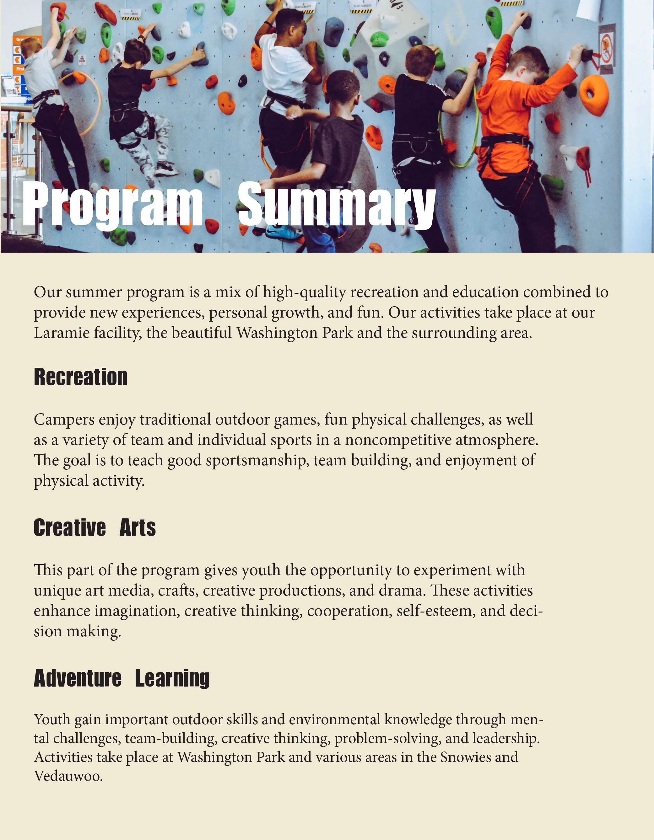
FINALIZE DESIGN
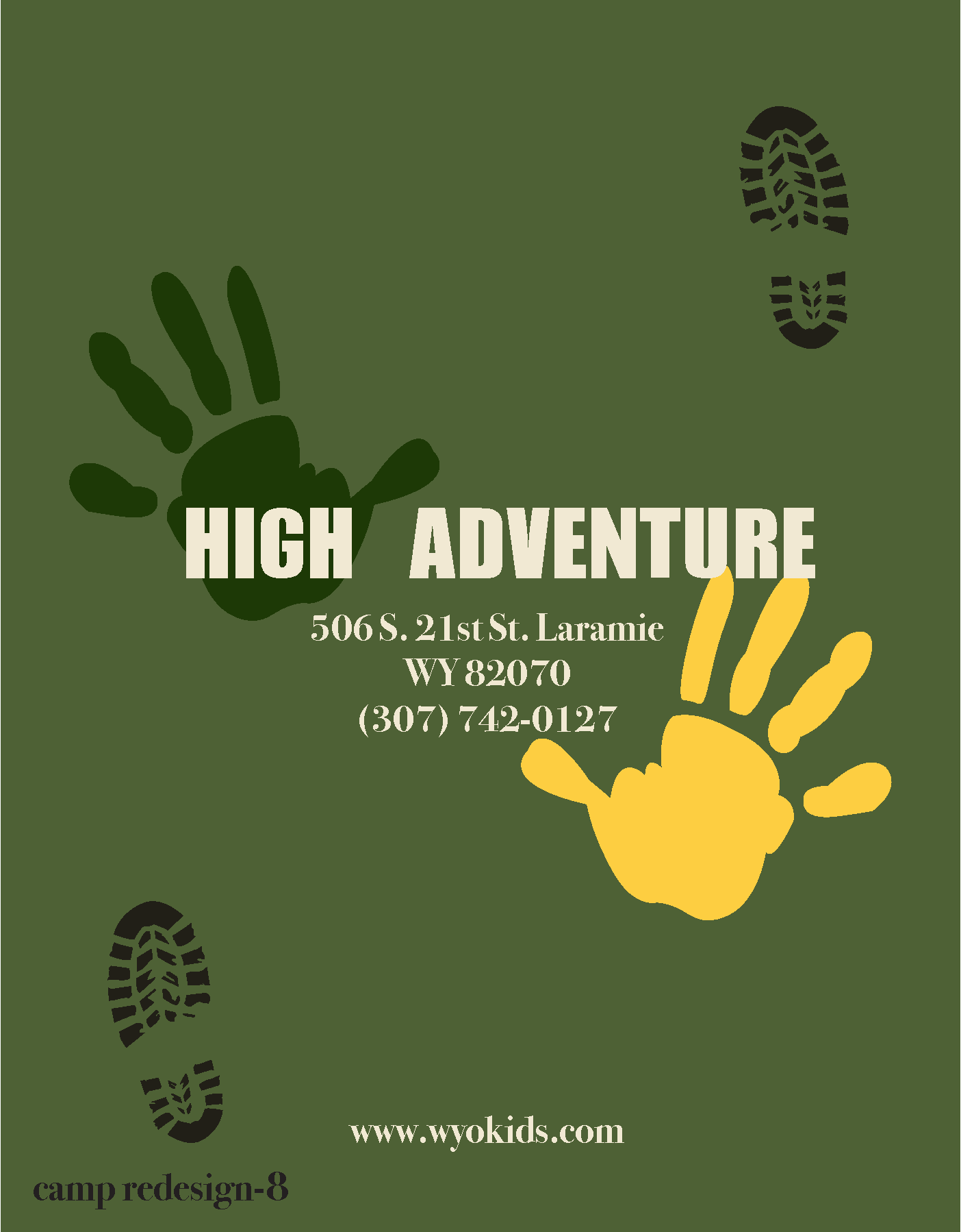
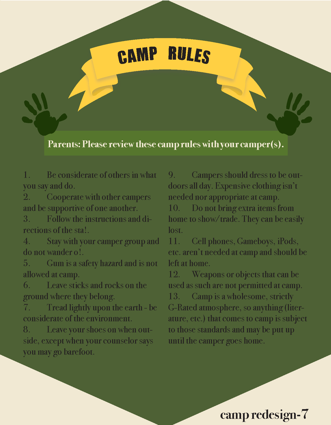
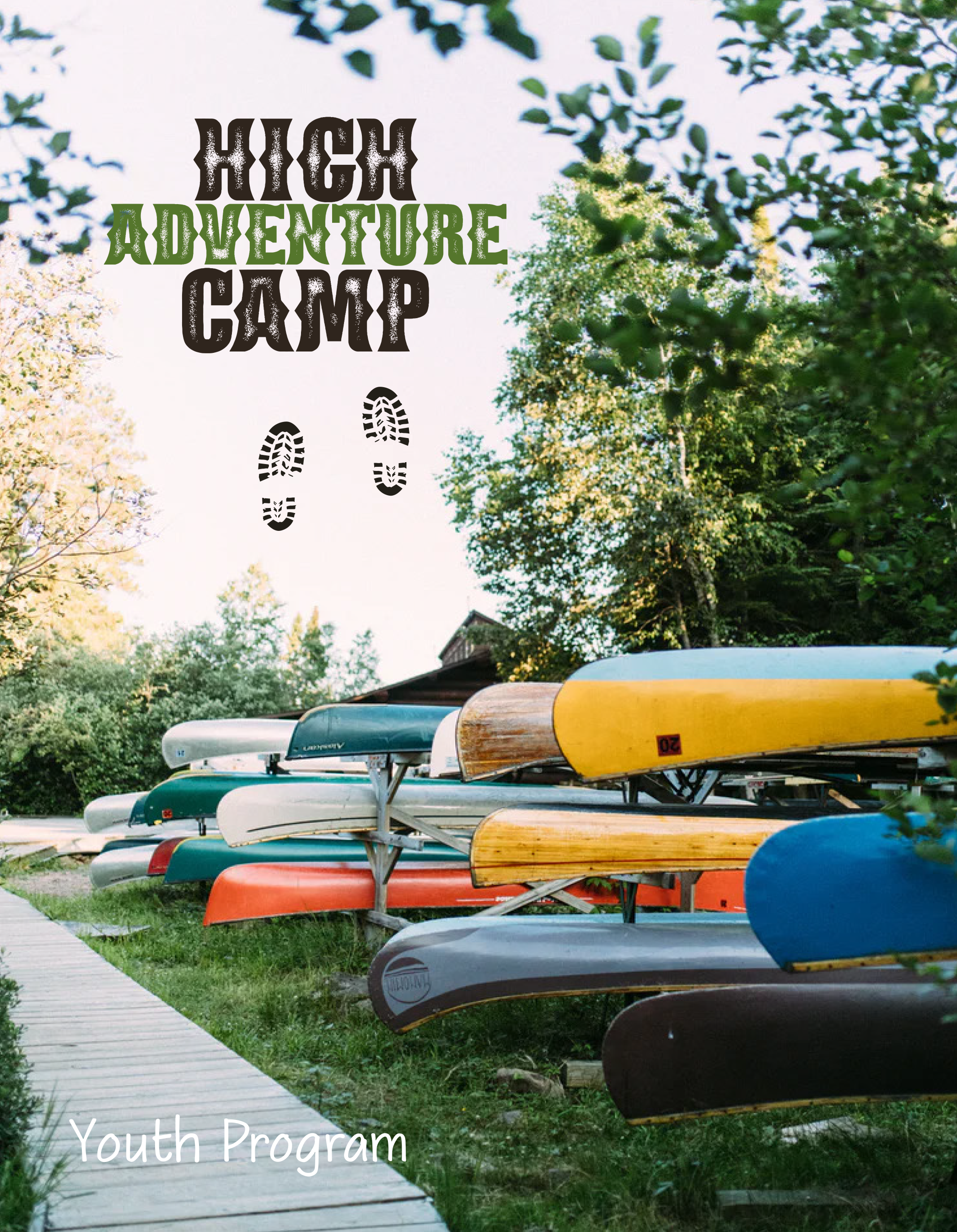
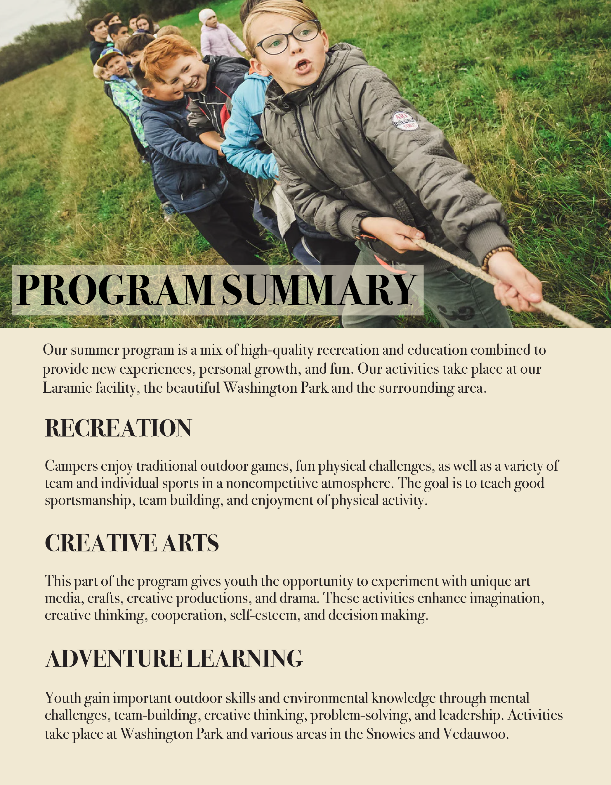
After selecting the most effective design, I finalized it by addressing typographic issues and establishing a clear hierarchy and structure. I also incorporated icons and made final enhancements to ensure a polished and cohesive look.


