TYPE SPECIMEN BOOKLET
BODONI
the PROBLEM
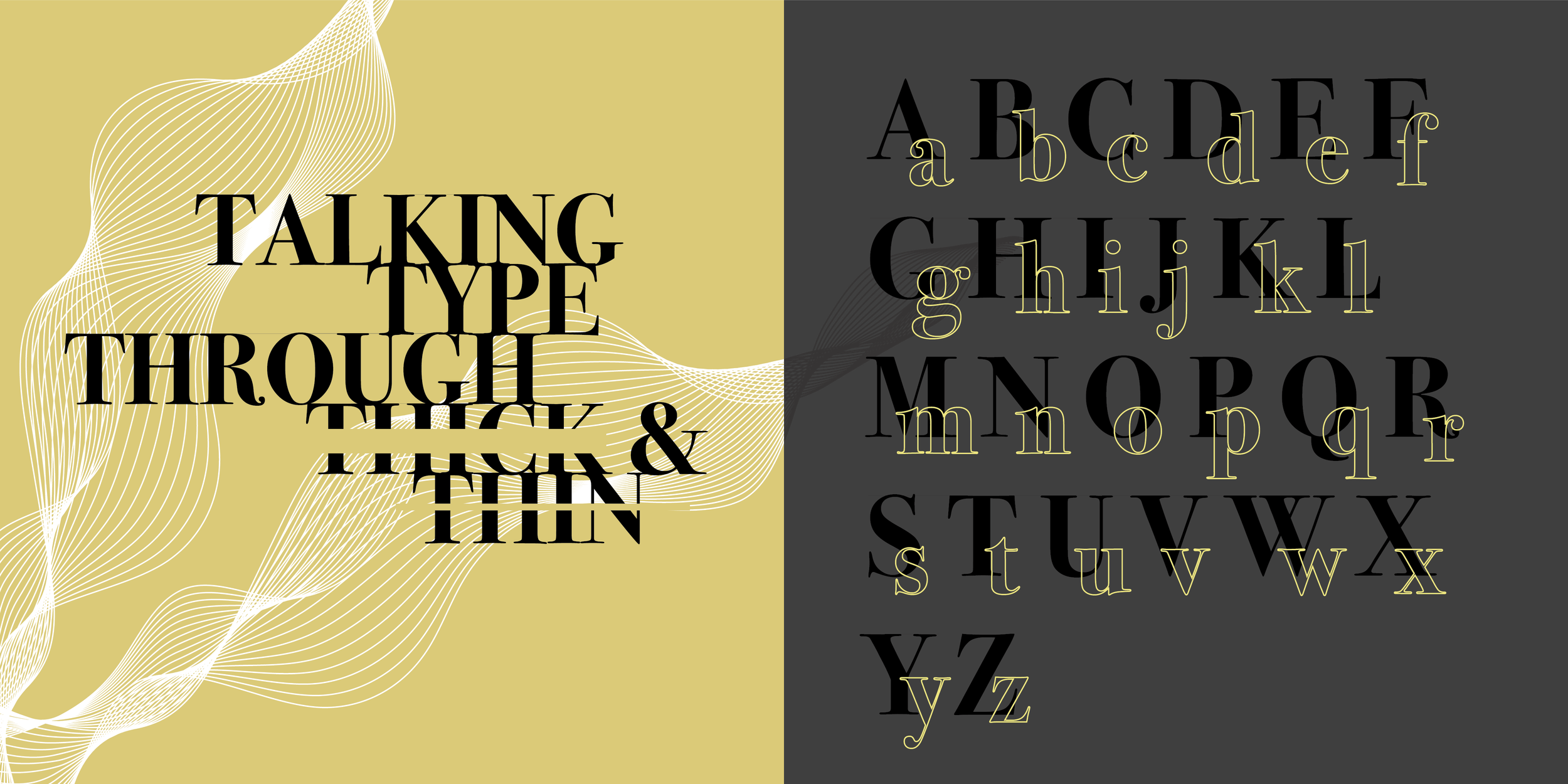
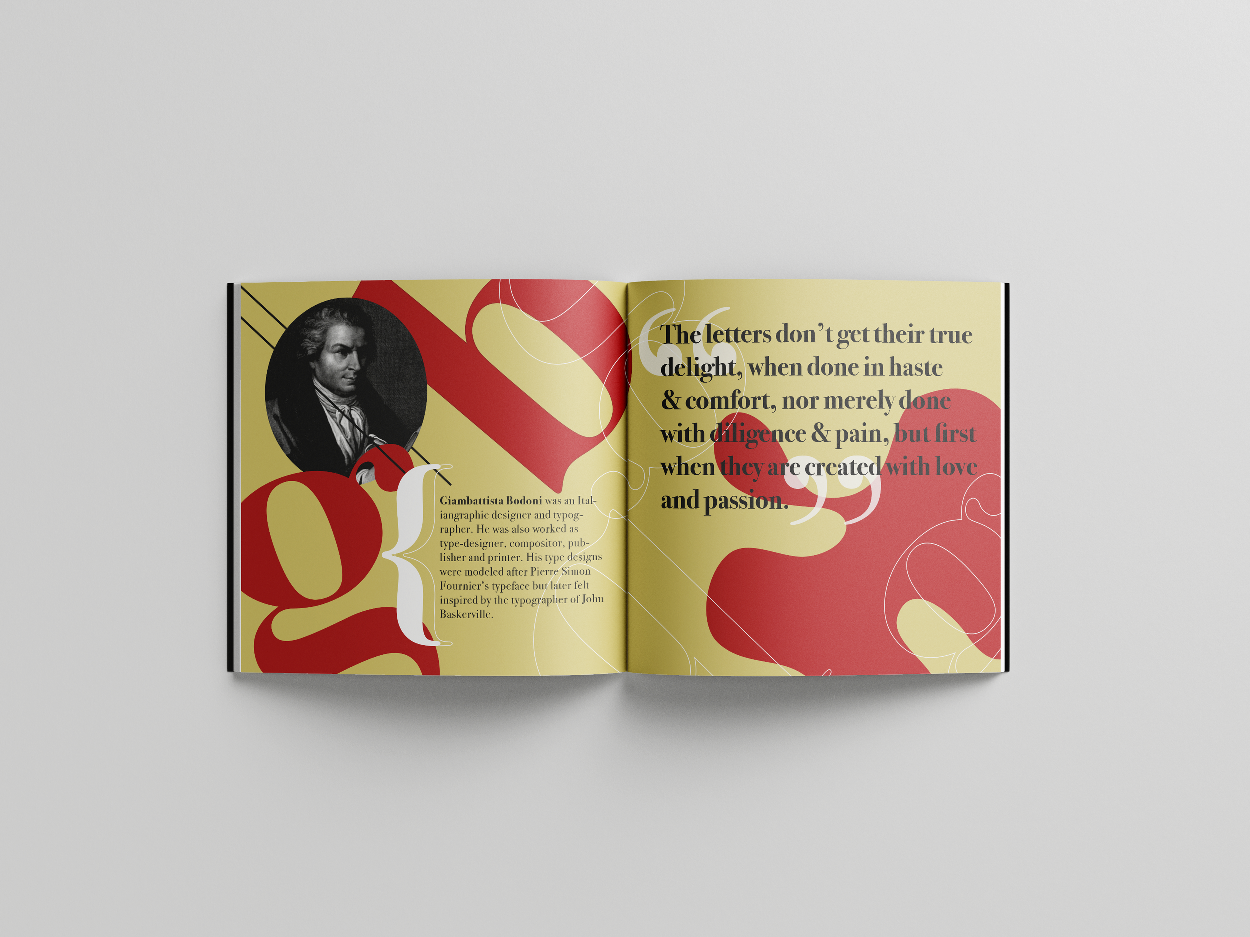
For this project, I created a type specimen book for a typeface. I chose Bodoni because of its elegance and sophistication. Its bold, yet soft; chic, yet simple. Bodoni is a serif typeface that was designed by Giambattista Bodoni, an Italian typographer, type designer, and composer, in Parma, Italy 1789. The purpose of this project was not just about choosing a font; it was about understanding the art and science behind it. Therefore, I was ecstatic to do more research on this typeface and style it the way I imagine it to be.
the PROCESS
Choosing a typeface to focos on was the first step in this process. By creating a document with a compilation of multiple typefaces, I was able to decide which one was the most appealing to me. I finally landed on Bodoni. In this process, I have delved deeper into the world of typography and I was drawn to compositions that turned text into visual art.
I was inspired by how the versatility of the typeface becomes a compelling narrative in itself, unfolding the essence of human creativity and innovation. Each font carries its own story and resonates with audiences in unique ways. It inspired me as a designer to push the boundaries of creativity, experimenting with typography to create captivating visual designs and express complex ideas with clarity and impact. My proficiency with the combination of Photoshop and Illustrator allowed me to manipulate type and graphics.
the INSPIRATION
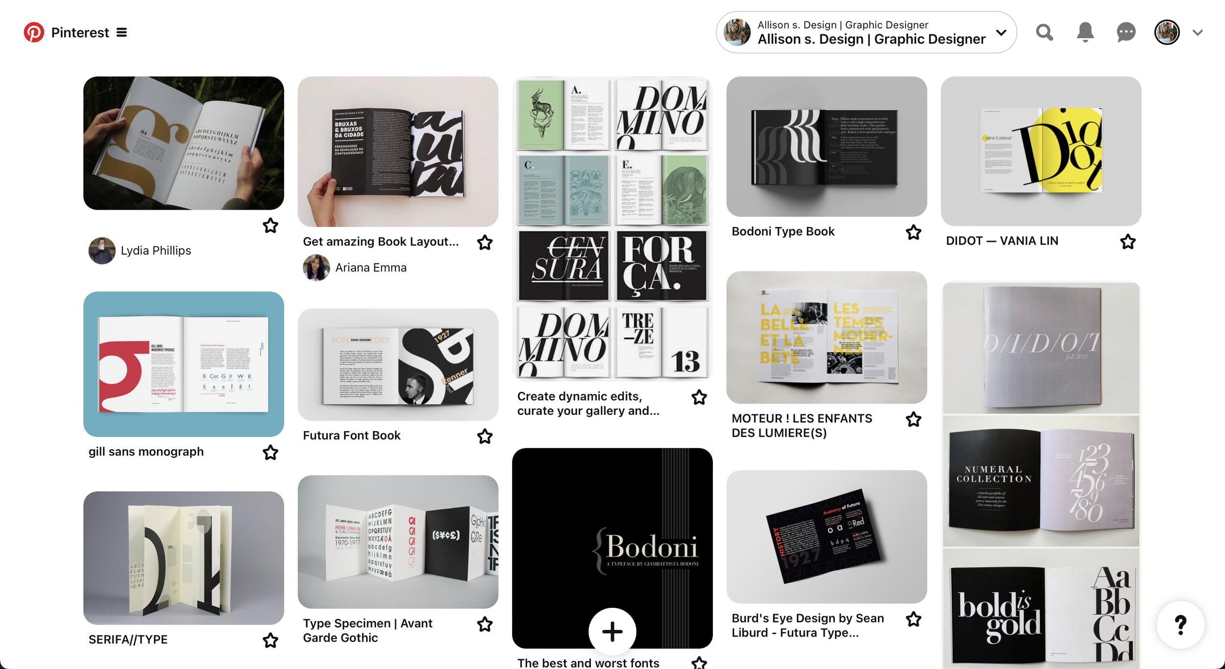
The next step was research. I wanted the type to be displayed in a unique and elegant way that would highlight each stroke of Bodoni typeface. I liked these designs that I found on Pinterest because of how they intertwined body text with heading text and made it look effortless.
SKETCHES
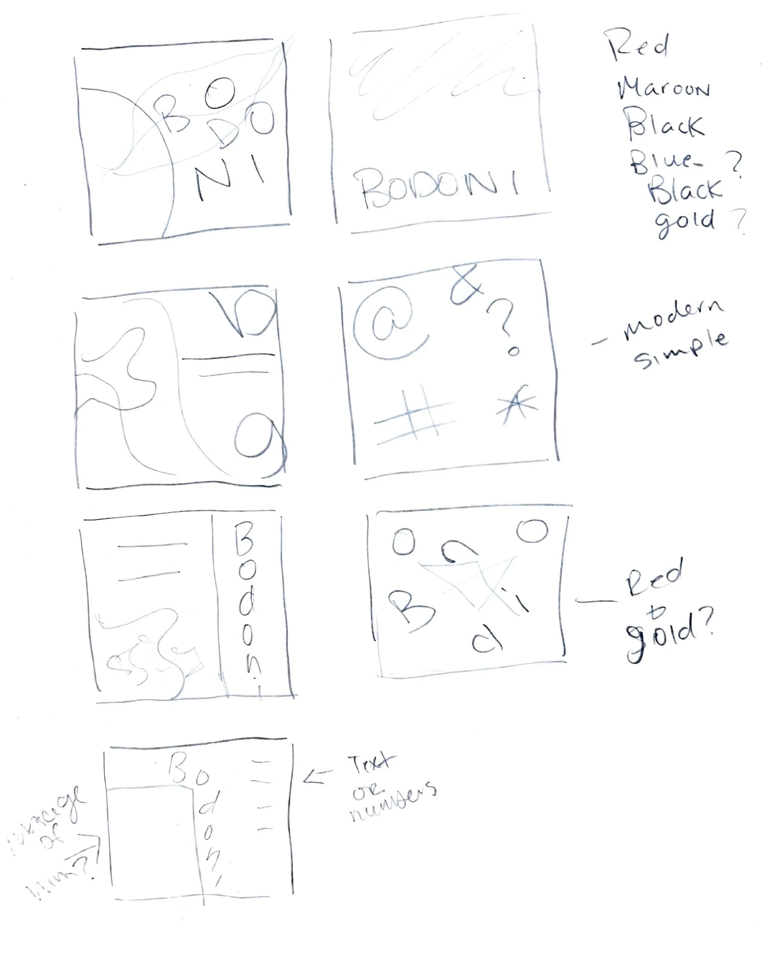
In this process, sketching is essential before designing compositions. This helped me generate ideas and visualize possibilities with conceptualizing designs. This lead to the creation of Bodoni booklet that are both impactful and meaningful.
COLORS & TYPE STUDIES
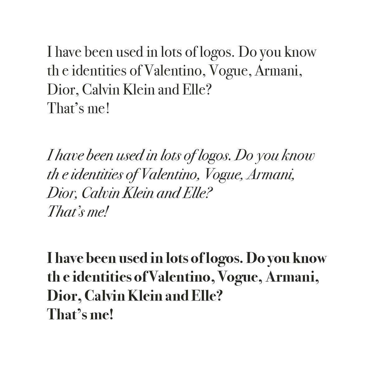
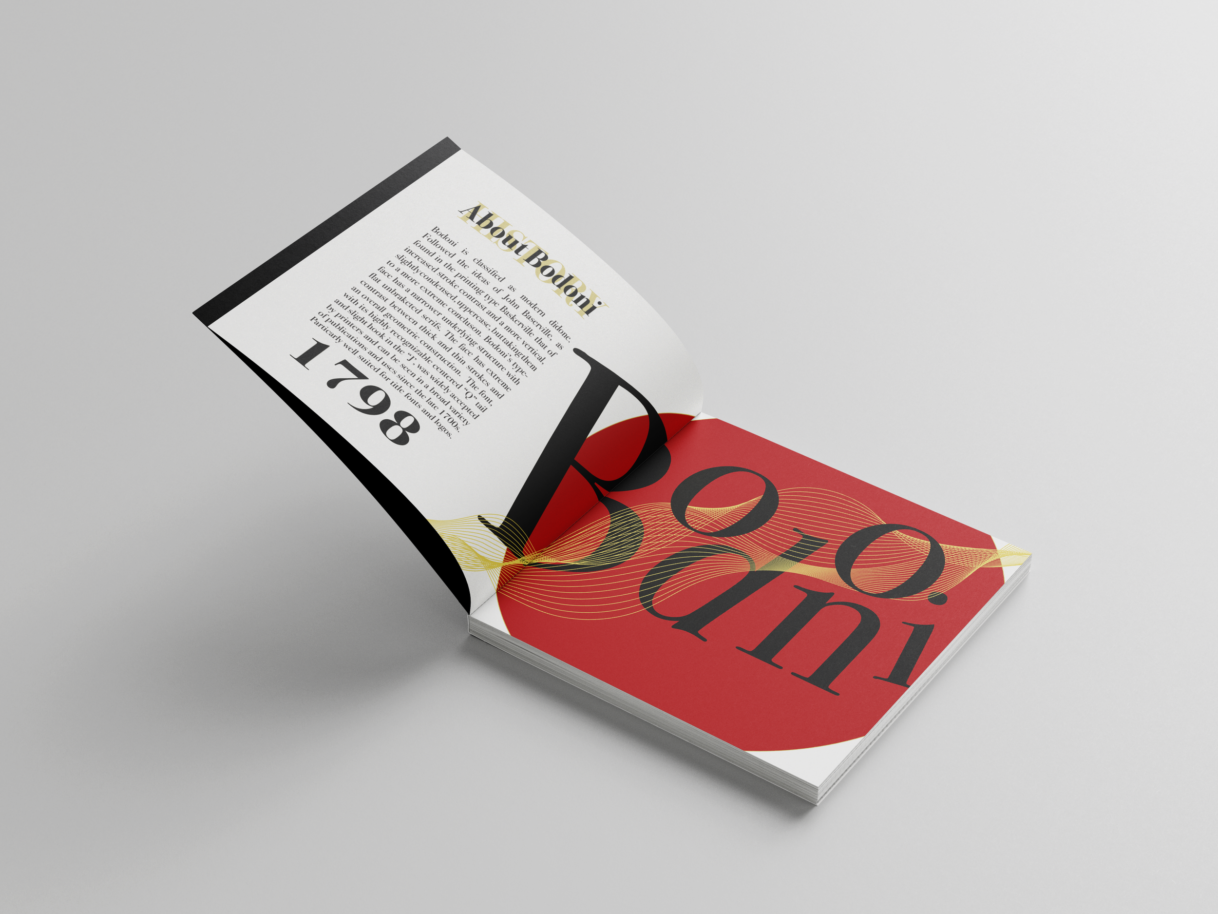
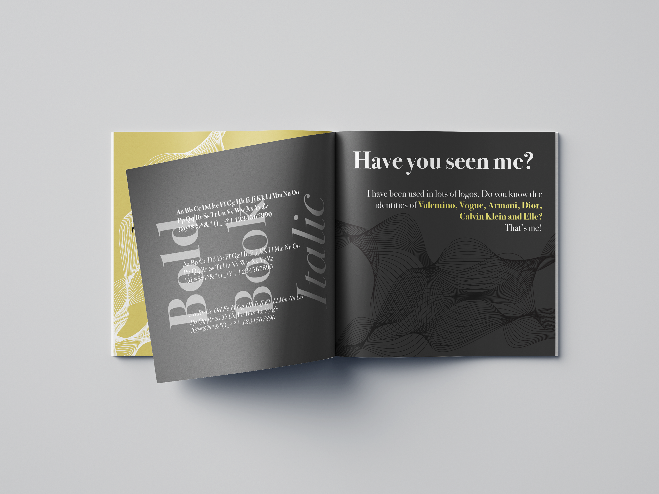
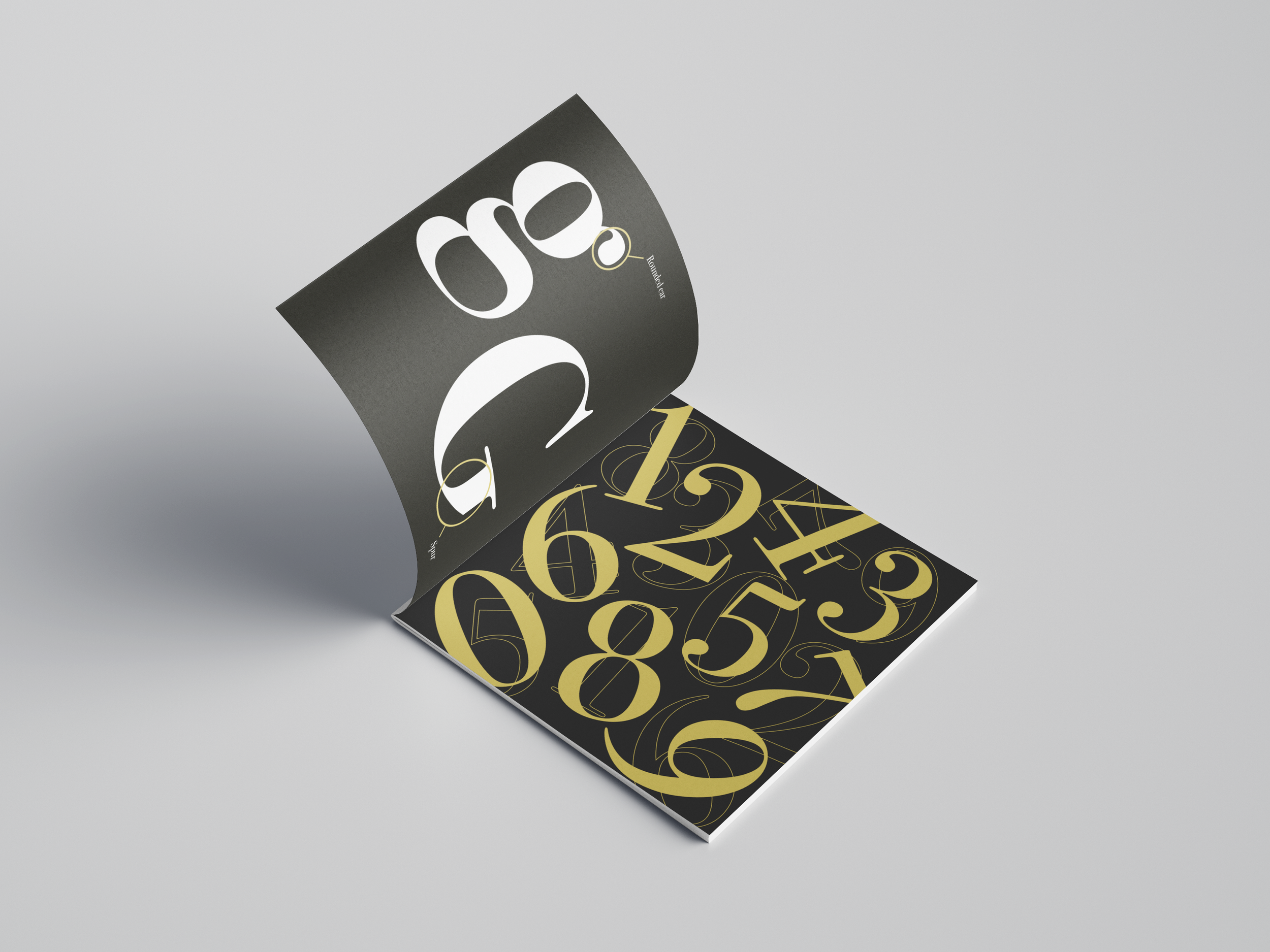
In my research of type studies, this typeface was used by the iconic grudge band Nirvana and the fashion magazine Vogue. I wanted to use this as a contrast to show off how this beautiful typeface could be used in an ironic way and show its true beauty with magazine spreads showing the letters as if they were models. It also offers a brief history of the type itself, so that is how I came up with these colors that represent ancient times.
Composition 4 & 5 pages Inside
Composition 1& 2 pages Inside
Composition 2 & 3 pages Inside
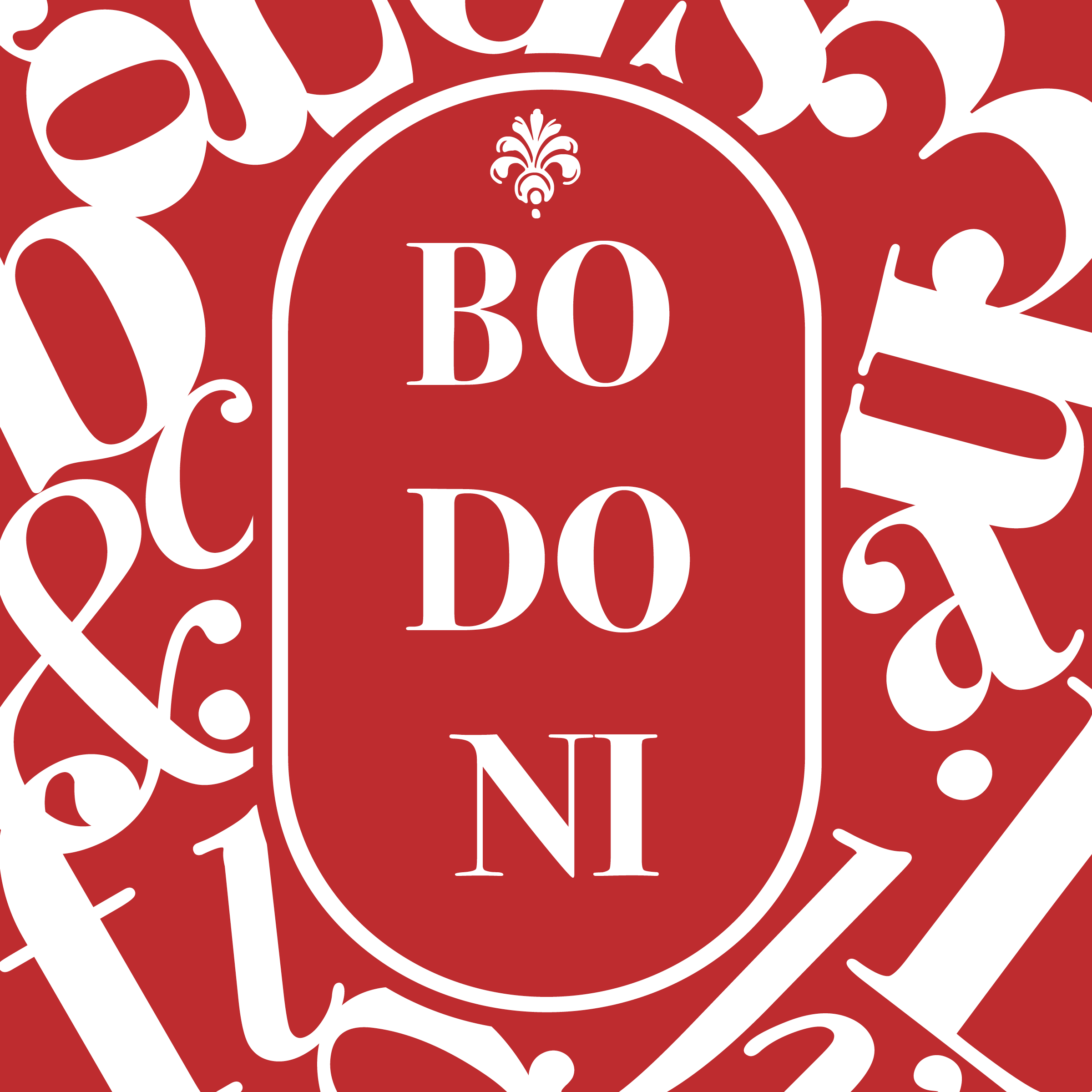
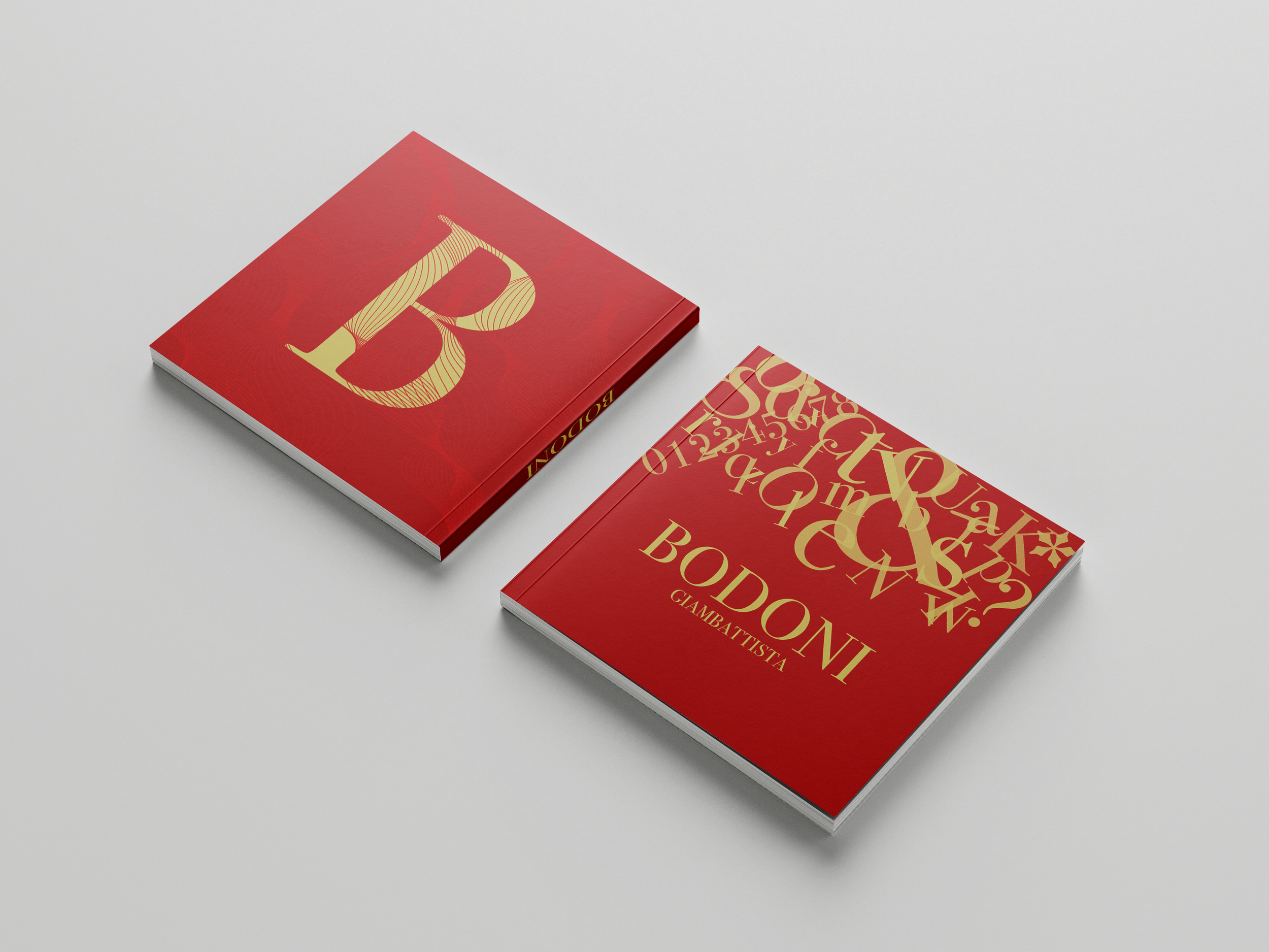
Composition front cover
Composition back cover
CONCLUSION
This was likely one of my favorite projects that I’ve ever done. It was rewarding from the start to the finish. Throughout this project, I have learned a lot about typefaces affect the content. The typeface hierarchy is significant when you are trying to convey information. It creates the contrast between elements to understand the purpose and objectives of the content first before being able to communicate it through design. Typeface hierarchy is a key part of every graphic design project and it is important to understand how to use text hierarchy to correctly organize the information of any design as a graphic designer.


