CHIP KIDD
Artist Print
the PROCESS
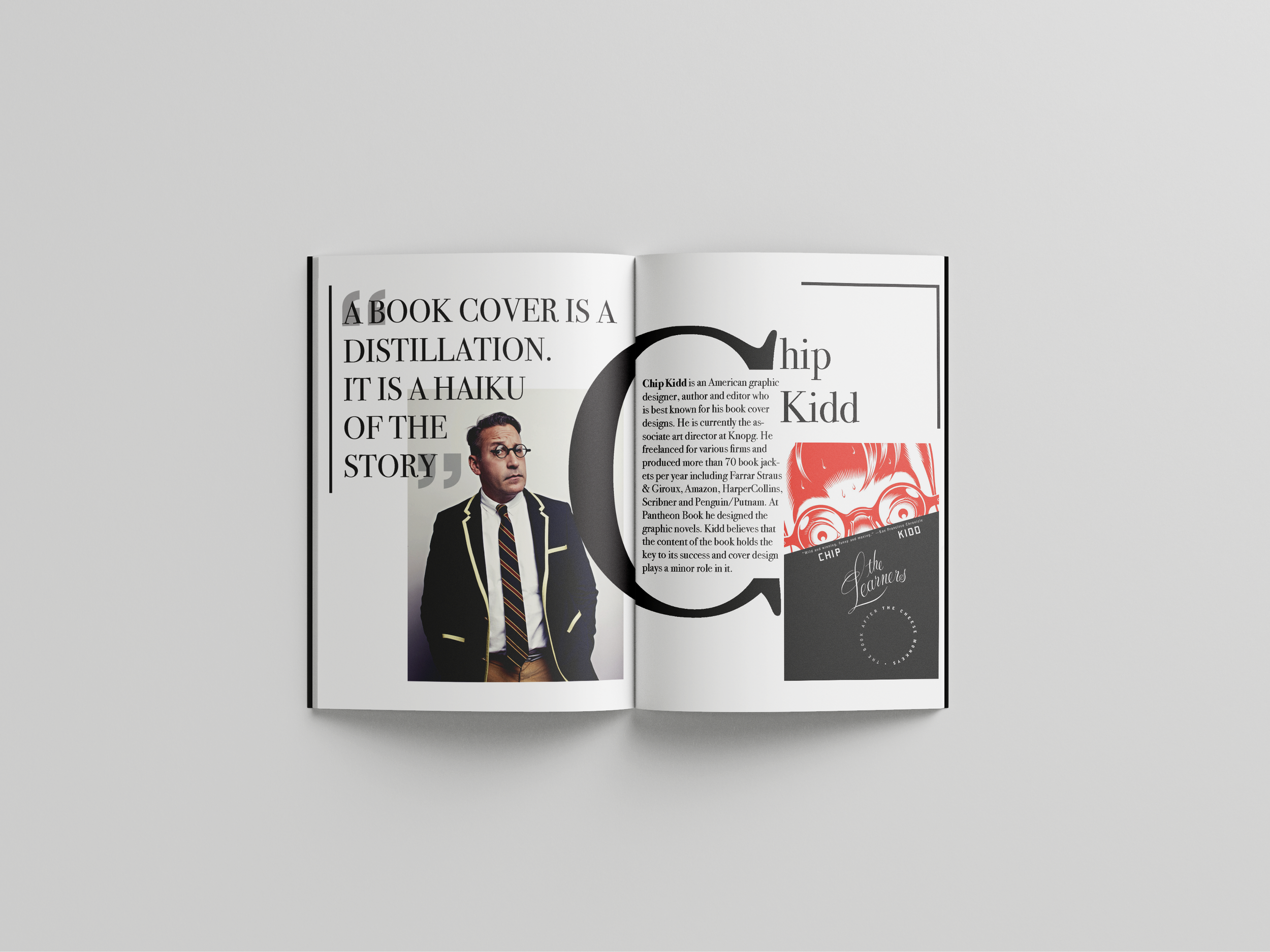
When I gathered all the information and collected high-resolution images of design projects. I conceptualized the book’s visual identity and selected appropriate typography, color schemes and layout compositions that enhance readability and aesthetic appeal. My goal was to make sure the design complemented the featured designer’s work while maintaining a cohesive and engaging narrative flow through the pages.
the INSPIRATION
I first started brainstorming and conceptualizing ideas. I got inspiration from Pinterest as I studied the designers’ tastes, backgrounds, and styles.
STUDIES
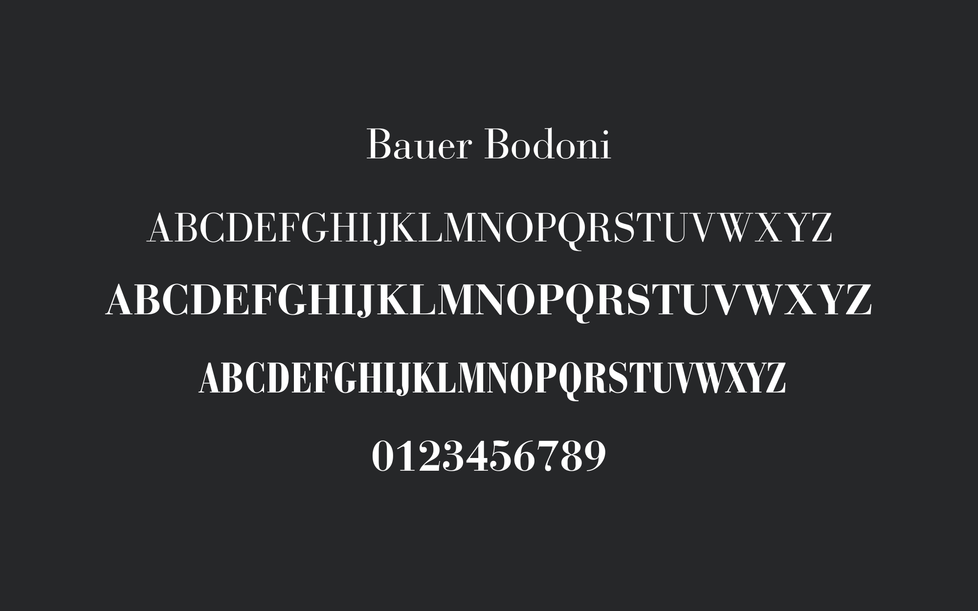
In an effort to capture the core of artistic expression while preserving the artwork's unity and impact, an intensive method of type and color research was done when Artist Print was first being created. I have created sketches after researching typographic ideas thoroughly choosing typefaces that complemented the print’s design aesthetic and readability criteria. I was able to create a perfect blend between font details and shades of color through successive revision, making each page a work of visual art.
the CONCLUSION
This was likely one of my favorite projects that I’ve ever done. It was rewarding from the start to the finish and really gave me my first-ever sneak peek into the world of typography. Typography is something I fell in love with from the beginning. Browsing through typography designs for inspiration, and being in awe of the work. I hold so much appreciation for typeface and the art.


