Willow & Whisk
Poster Design
the PROBLEM
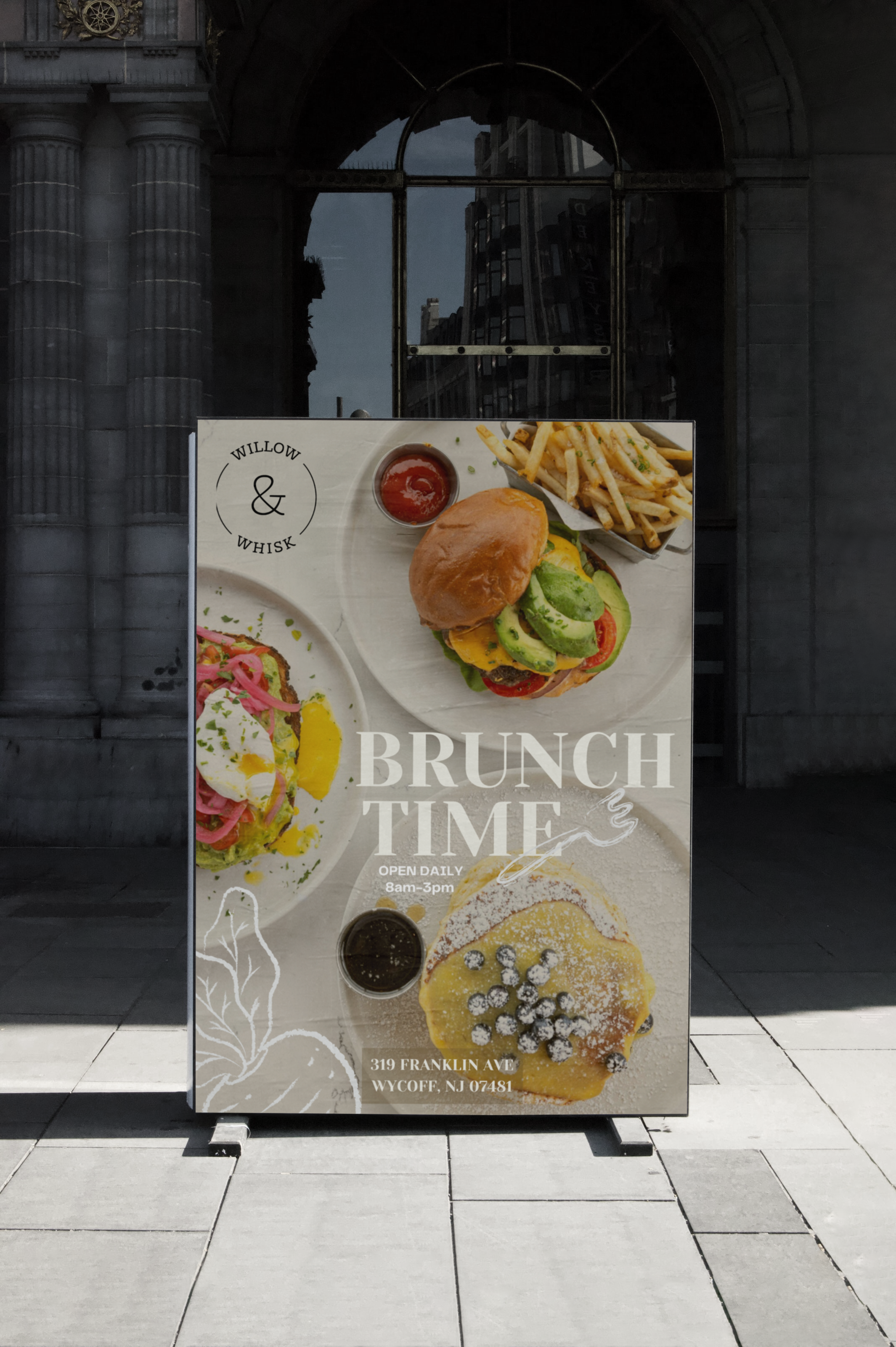
For this project, I chose to do a event calendar poster for a brunch restaurant. The event calendar poster is designed to celebrate the joy of brunch and highlight the special event hosted by the restaurant. The goal is to display an eye catching poster that encourages customers to mark their calendars and attend the celebration.
the PROCESS
The first step in the process was to gather all the information that needed to be on the poster. This included dates, and location. I took a look at their website to decide on the style of the calendar. Through the visual research, I found that the designs should be minimalistic and aesthetic.
the INSPIRATION
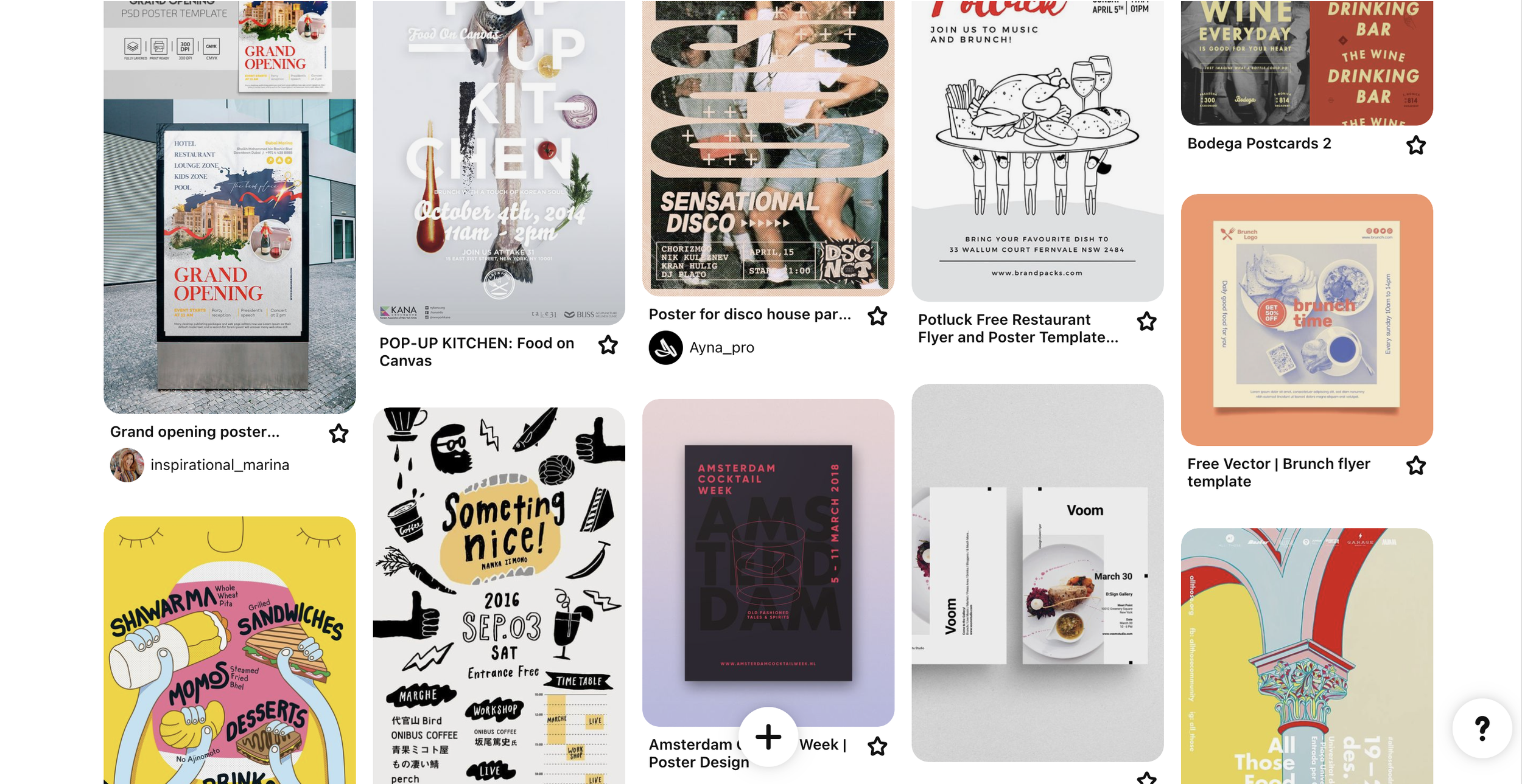
Before I sketched, I needed some inspiration, so I went on Pinterest and found some of my favorite layout designs.
SKETCHES
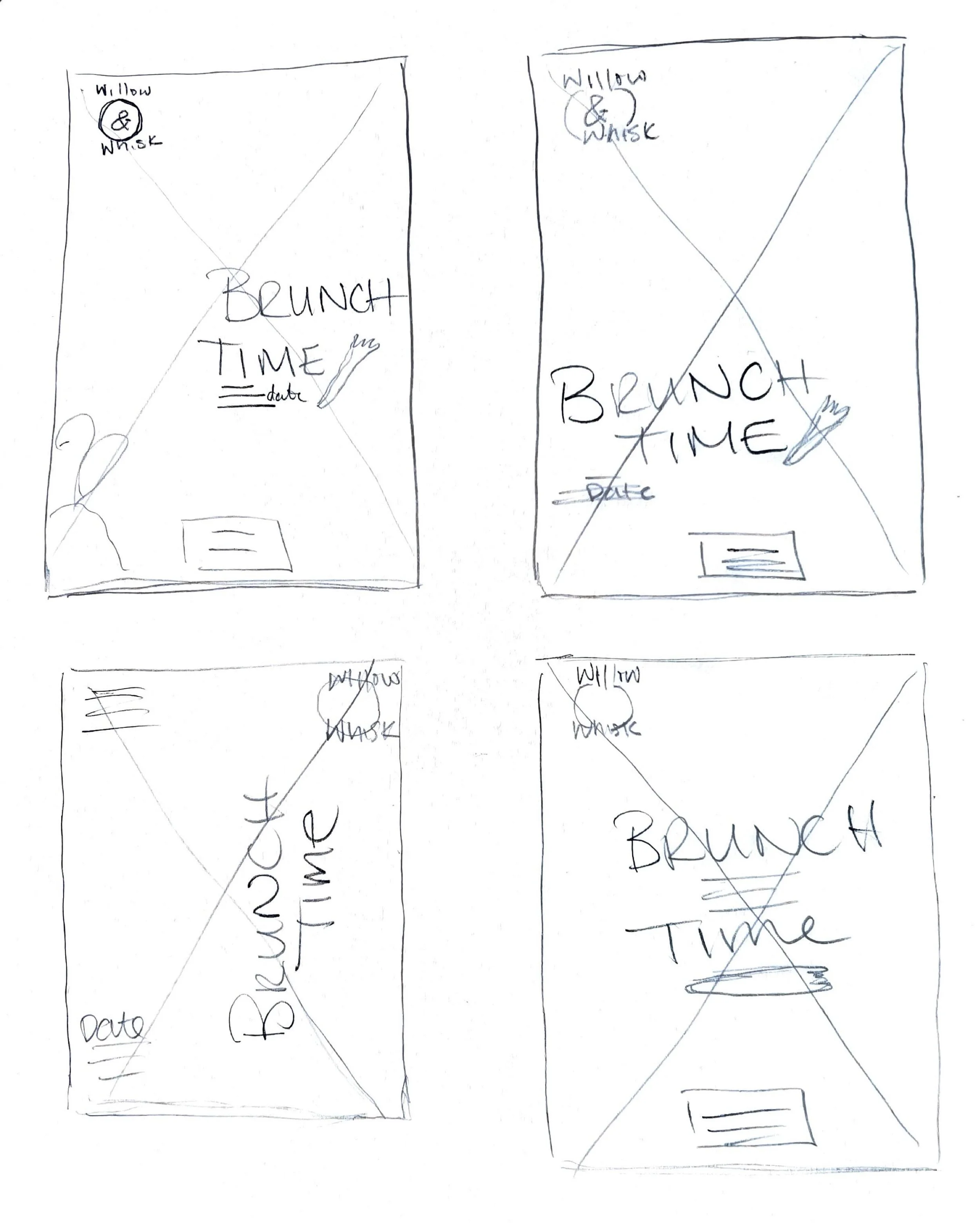
Choosing the typeface was the most important as readability and hierarchy of information was the focus of this project. So, I sketched out a few of layouts.
TYPE AND COLOR STUDIES
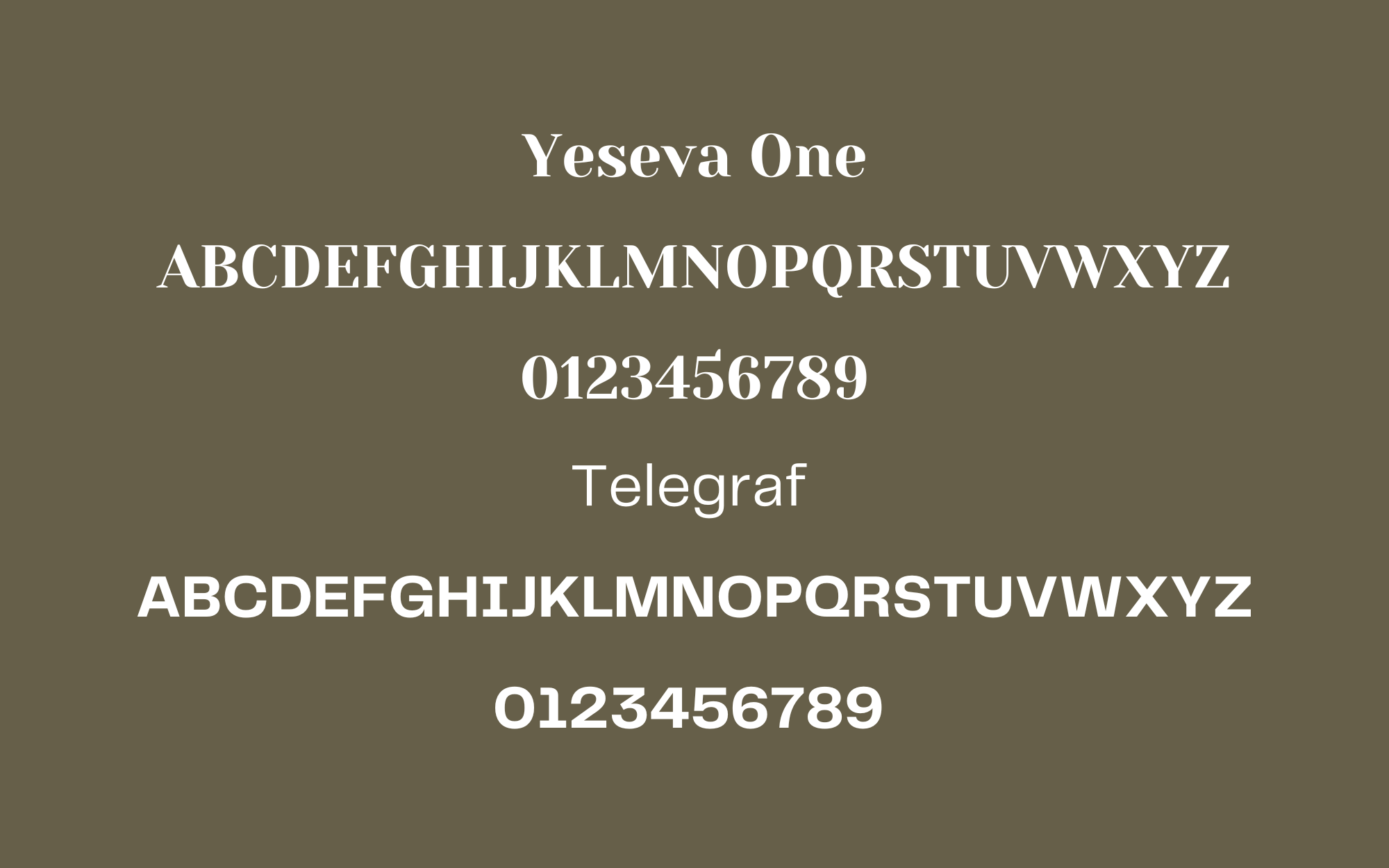
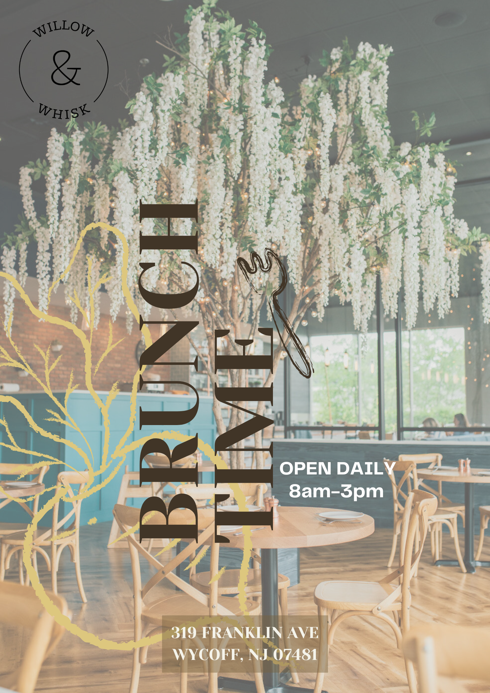
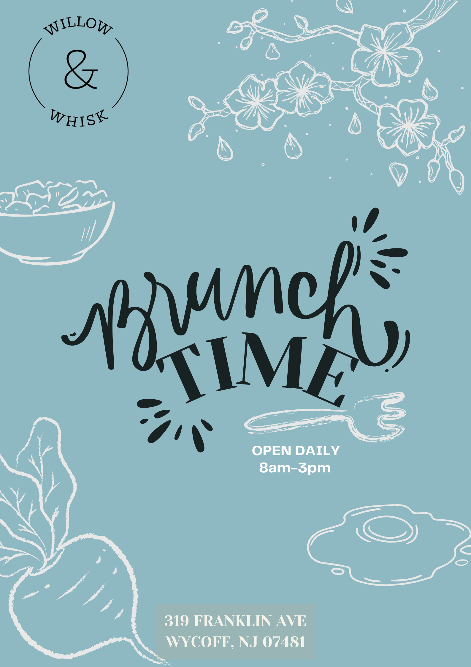
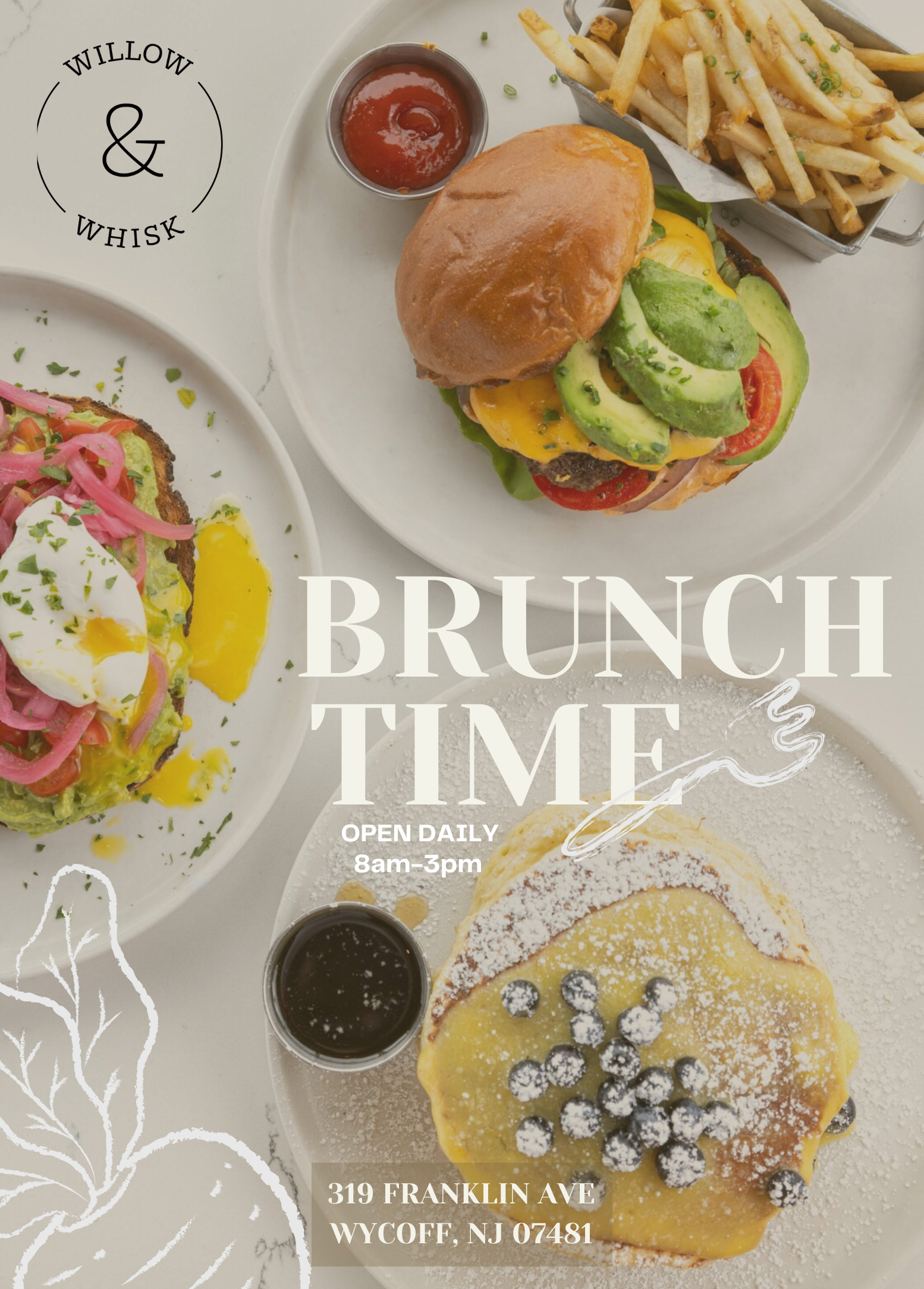
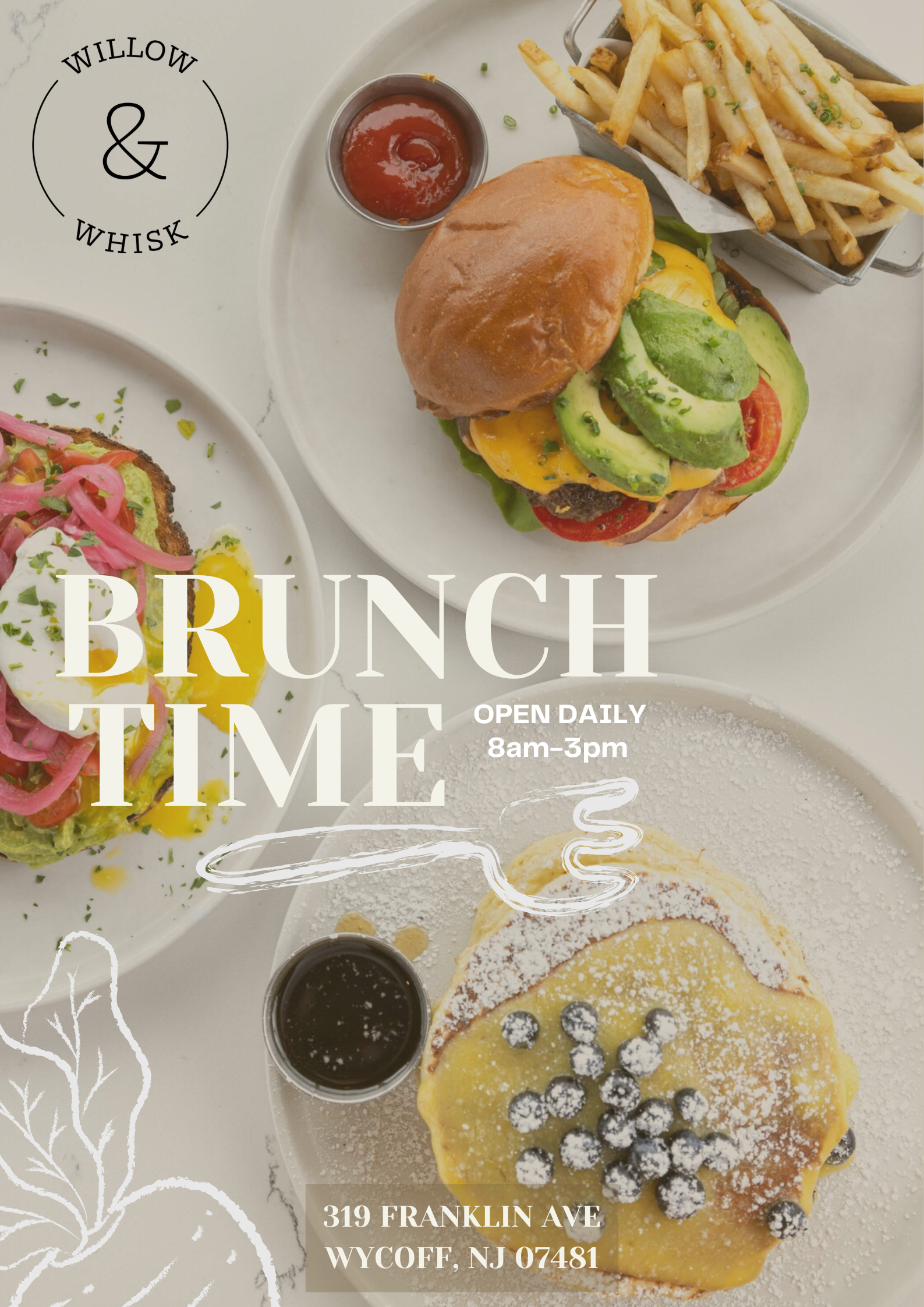
The poster gives an authentic aesthetic, capturing the essence of a cozy, friendly brunch spot. It focuses on simplicity and authenticity to convey a sense of nostalgia and comfort. I chose Yeseva One font that gives a soft and elegant that gives a “feminine vibe”. Once, I found a picture, I featured some hand-drawn doodles and added muted color fonts.
COMPS & CRITQUES
I got feedback on all of the compositions from my peers and revised them. I took notes on each design and chose which ones to move forward with.
brunch time is hard to read
move date
could have more doodles
the doodle is too big
doodles are cute
could use more colors
picture would be better than a color background
Comp 3
Comp 4
Comp 3
very bright and easy to read
feels very welcoming and authentic
great alignment with the information
Comp 4
very bright and easy to read
feels very welcoming and authentic
too cramped to the left
could move doodles and information around
the LEARNINGS
Through my experience, I have gained a deep understanding of how typography and information layout can have a significant impact on the success of a design. Additionally, the strategic use of color and image can capture the audience’s attention and improve the overall aesthetic appeal of the design.

